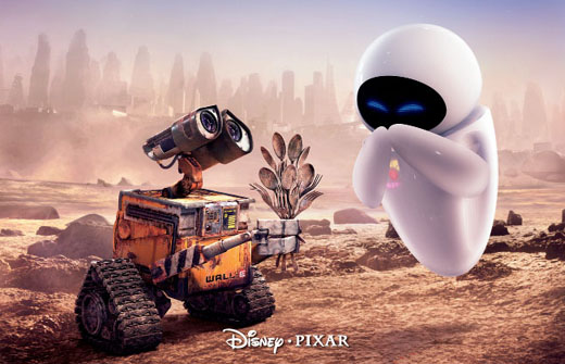
The two images I chose were from Toy Story 3 and Wall-E, I will be comparing and contrasting the color and lighting of these images. The hue and brightness in Toy Story 3 involves a lot of color, bright, vibrant colors, lots of greens, yellows, etc. and the brightness surrounds the characters. The sun is shining and it pokes through the trees and hits their faces; which are more indicative of its subject matter, which are family and togetherness as well as unity and teamwork. Then there is the hue and brightness in Wall-E which is pretty monochromatic, mostly drab, earthy tones like brown and white and grey; and as far as brightness goes the setting is pretty dark but the characters themselves stand out, specifically the white new robot; which works because it’s a movie about a desolate earth and a lone robot that is presumably completely alone in the world and his discovery of life. Then you’ve got the saturation of Toy Story three which is very heavy, the entire thing is deep colors that represent the liveliness in the movie. In Wall-E, the saturation is very low and the colors are extremely pale, representing the emptiness in this movie. Next there is the lighting in each film. In Wall-E there are a lot of shadows, mostly in the background to give the mysterious nature of the land. In Toy Story 3 the shadows are more used to highlight the characters than anything, give them a more realistic and natural look as well as drawing attention to the emotion in their face. All of this creates a mood in Toy Story that is very emotional, whether that is nostalgia, happiness, sadness or acceptance it’s all there. In Wall-E the mood leans more towards uncertainty and fear, but also hopefulness when you see the random spots of brightness on Wall-E and the other robot. This is all used to symbolize loneliness and the ever-changing landscapes of our lives and ultimately hope. In Toy Story the symbolism is more about moving forward, looking toward the future and accepting that things change.


No comments:
Post a Comment